Why I Hate Designing Websites
It’s official. I hate designing websites!
For the past 3 weeks, and in between painting and other creative projects, I’ve been trying to redesign my website. The current design was something I furiously cobbled together a few months back and I’ve never been happy with it. Some of it works, some of it doesn’t and I’m beginning to wish ‘all of it’ worked because this redesign is turning in to a headache. Fast!
Attempt 1: Sketchy Storybook
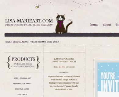
My first design attempt was influenced by paper textures and hand drawn elements. I loved the little kitty and bee in the header and all was going well until I tried a mock up layout with content. I couldn’t get a balance and in the end it just didn’t work.
Attempt 2: Retro Vintage
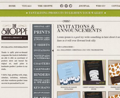
At first I thought this was going to be the one. I have an obsession with vintage books and all was going swimmingly with retro typography and a 3 column layout. The shop section was looking great but when it came to the portfolio and blog the same old problems came back. No unity.
Maybe I’m asking for too much of this design? My vision is modern with a vintage twist and slightly influenced by book layouts. Something which works with both my traditional painted work and my vector and computer aided illustrations. Something which is timeless and I won’t have to change (not in the foreseeable future anyway).
I’ve seen a shed load of websites which use the kind of design I’m working towards and I just can’t seem to get mine to gel. Maybe I’ll be third time lucky.


2 Comments
Faith
Hi!
I love your work and I know exactly how you feel about designing websites. I got so fed up last year that I closed all mine down and went for blogspot instead. But that proved very taxing! Then I remembered a website I put up free at gmx in 2002! No longer having a domain anywhere, I revived that and modernized the content,. but I left an absolutely excruciating flash movie up there because I still can’t get going with a proper design (or proper domain).
Your design here is very ambitious! gmx is skinny about space, so I shan’t stay there long. On the other hand……..
Lisa Marie
Faith, I know what you mean. I started off on blogspot but ended up moving to my own domain on Dreamhost and installed WordPress because I didn’t like the limitations and headaches with blogspot. I hope you eventually get up and running properly… and your flower paintings are beautiful! I love the Baroque Rose.